Team
Ryan Brooks
Elisandra Diaz
Sammy Gonzalez
Elana Naids
Libbey Saelzler
Isaac Valadez
My Role
Research
Strategy
Design
Timeframe
8 weeks
Deliverable
High Fidelity Prototype
Team
Ryan Brooks
Elisandra Diaz
Sammy Gonzalez
Elana Naids
Libbey Saelzler
Isaac Valadez
My Role
Research
Strategy
Design
Timeframe
8 weeks
Deliverable
High Fidelity Prototype
Problem Statement
Food trucks are unpredictable. Unlike a stationary restaurant, location and schedule change all the time. This is a problem for people with limited lunch-time, looking for a food truck they saw before or those who want to try something new but don’t know where to find it. Getting up to date information of food trucks, like the menu, hours, or phone number, is also difficult.
Enter FUBER – The Food Truck Finder App! The app will allow users to find food trucks near them through a Map view or filtering by food type. The users can also access general information like: type of food, menu and prices, directions to the food trucks (location), how long they’ll be in that location and where they are going next (schedule). Users can also track specific trucks and get notifications whenever they are close to their location.
Design Charrettes
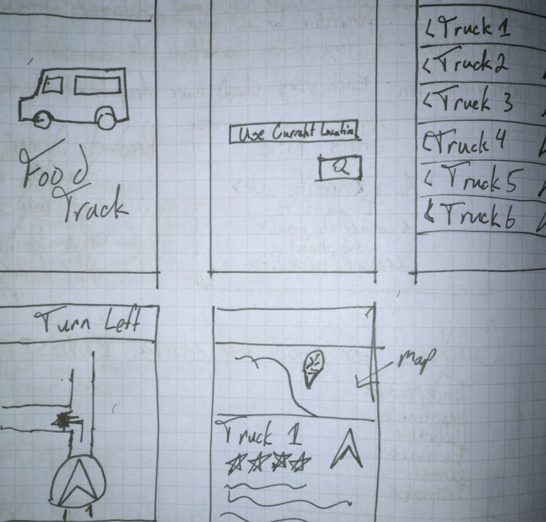
After Initial charrette we decided on a general app idea and refined sketches. Each team member developed sketches and provided feedback. We landed on the Food Truck Finder App, which allows users to view Food Trucks near the user through a Map view, open hours, directions, menu, deliciousness rating, etc.

Moodboard
We collected ideas and inspiration for the app on a share Pinterest Board. Here we housed design concepts that we liked, ideas of similar apps, and the type of imagery that we’d like the app to have.
User Personas
We developed three primary user personas to represent the types of people that will use this app and the types of problems that these particular users might face.

Key Features
As a student, I need to see an approximate price range, so that I can stay within my budget during lunch.
As a user, I need to save my favorite food trucks, so that I can find the location of my favorite trucks at any time.
As a vegan, I want to hide all non-vegan food options, so that I can find great food that fits in my diet.
As a food truck owner, I want to see where most FUBER users are located, so that I can park my truck closest to them.
Style Guide
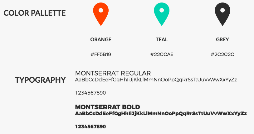
For a food truck location app, we wanted a design that would catch the attention of hungry 20-somethings, while still representing the small business owner of a food truck professionally. The bright teal and orange colors contrast the grungy dark greys to create a polished yet trendy look to engage users.

Wireframes
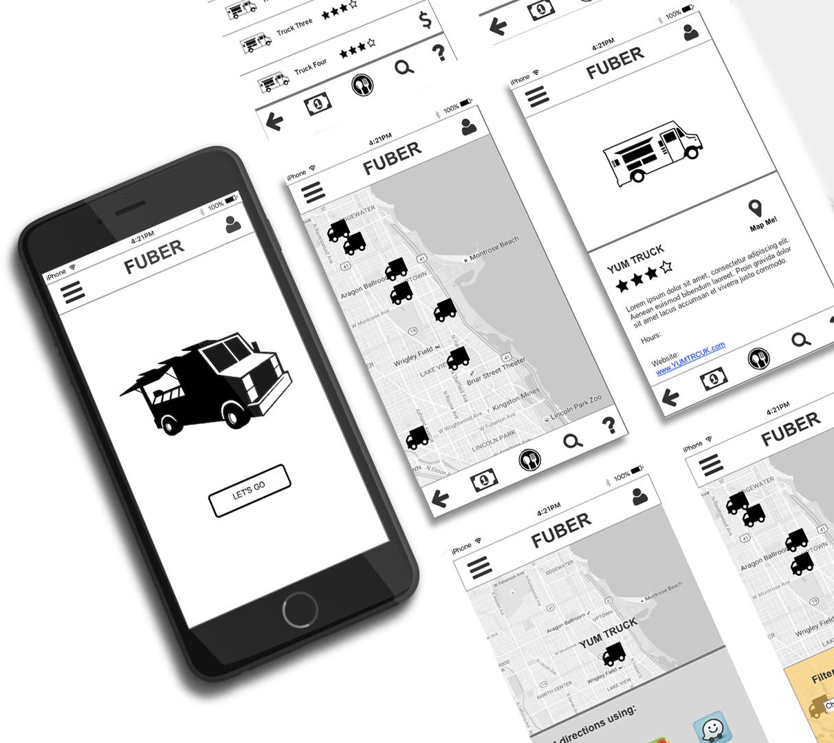
We designed low to mid fidelity wireframes so that we could start getting a design in front of users for user testing.

Final Hi-Fi Prototype
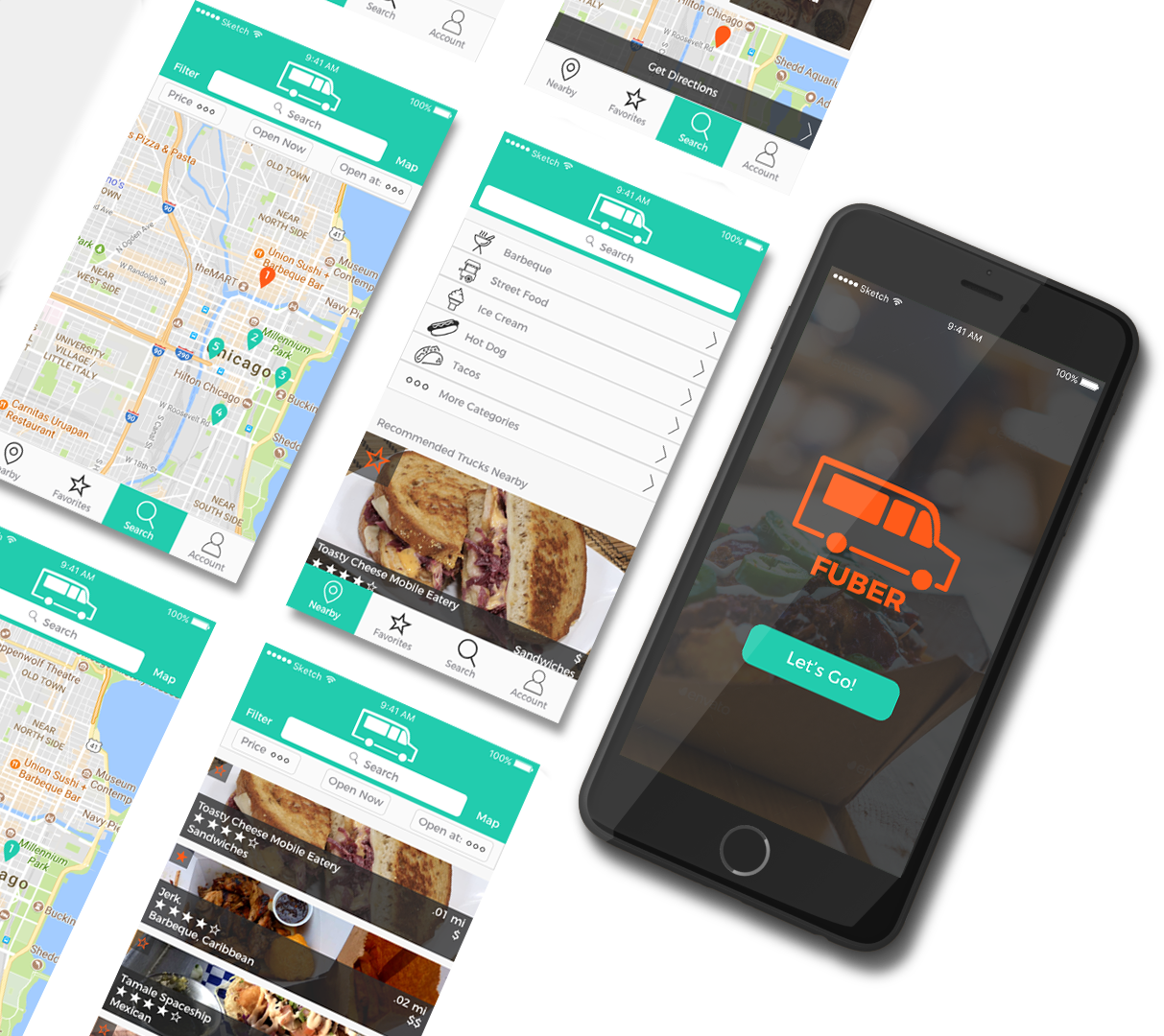
After 3 rounds of usability testing and iterations on the wireframes created in Axure RP 8, I designed a high fidelity prototype taking into account our findings using Sketch App and Principle.
